
Gift Ideas for Architects
Are you looking for the perfect gift for an architect in your life? Whether it's for a birthday, holiday, or just because, architects appreciate gifts that are both functional and stylish. Here are a few...


In architecture competitions, the presentation of your panels is crucial for standing out and effectively communicating your ideas. Here are five tips related to design and art to help you improve your panel presentations, complete with detailed examples:
Example: Imagine you’re presenting a new eco-friendly residential complex. To create a strong visual hierarchy, place a large, striking rendering of the complex in the center of your panel. Surround it with smaller, supporting images like floor plans, sections, and key details. Use bold, larger fonts for titles and subtitles to differentiate them from body text.

Example: For a futuristic skyscraper project, use photorealistic renderings that show the building in context, with realistic lighting and textures that capture reflections, shadows, and material details. Complement these with hand-drawn sketches that showcase the initial concept stages and design evolution.

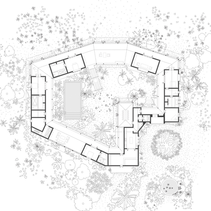
Example: If you're showcasing an urban park design, divide your panel into sections. One section might have a large aerial view of the park, another with detailed images of playgrounds and green areas, and a third with explanatory text. Use bullet points or short paragraphs to make the text digestible.

Example: For a sustainable housing project, choose a color scheme inspired by nature—greens, browns, and blues. Apply these colors consistently across backgrounds, titles, and graphics. Ensure your font choices and graphic styles (e.g., icons, line weights) are uniform throughout the panel.

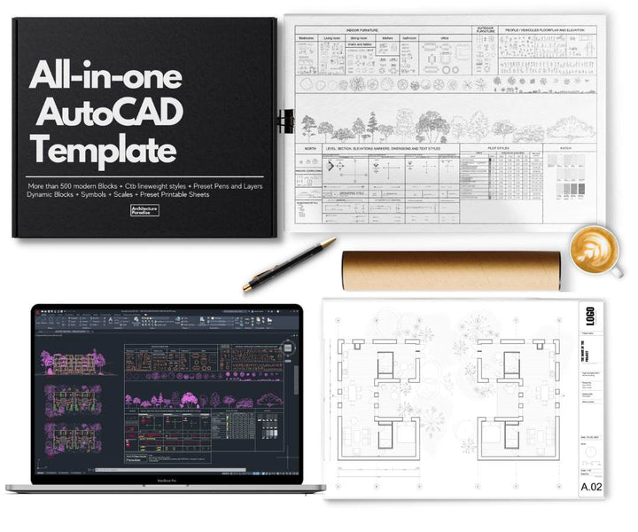
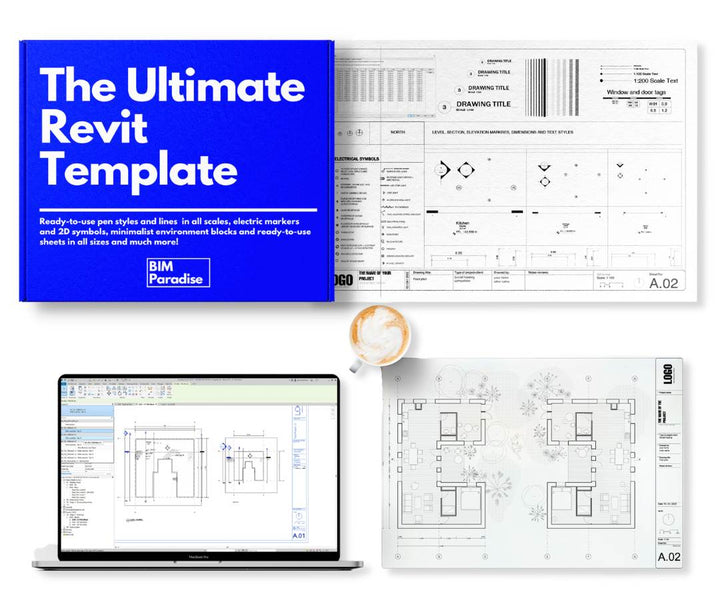
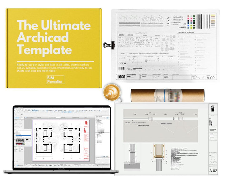
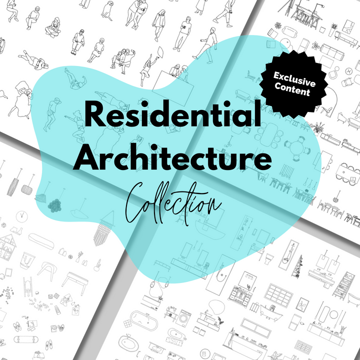
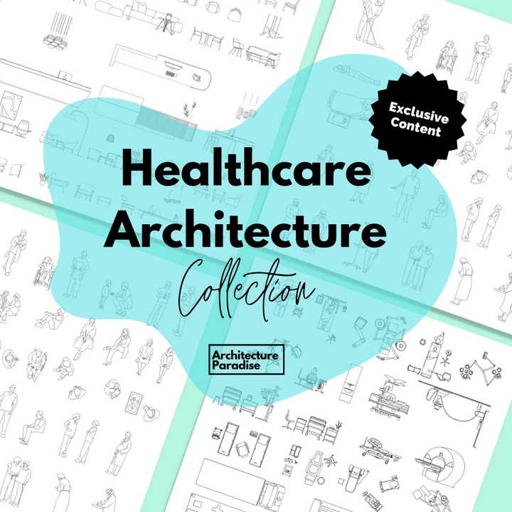
Example: Use a professionally designed template from www.architectureparadise.com that provides placeholders for images, text, and diagrams. Customize these placeholders to fit your specific project, ensuring that each section is well-organized and aesthetically pleasing.

Example: For a heritage building restoration, ensure that every line in your drawings is crisp and clean. Align all elements precisely and use consistent spacing. Check for spelling and grammar errors in your text, and ensure that all images are high resolution and properly cropped.
